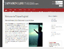
As we've have begun making TaiwanEnglish.com less grey-coffin and more amazing-blue wonder-site, I've been wanting to make note of some interesting practices I've picked up along the way to website greatness. Some of these may be laying around on the Internet (lying around?), but I genuinely believe that these may help some new-comers to design.
1) When E-mailing, put the Name of Your Site in the Title of the E-mail: Whether you want to update your site partners or are e-mailing about links exchange or some other aspect of your site, this practice makes it easy to gather up e-mails that are related to your site. This is also good PR and branding. In fact, it's also best to make a separate e-mail address for the site, as your personal one may not be business enough. You'll also have to worry about spam-spiders picking-up your personal address and people knowing who's to blame if something goes wrong on the site.
2) Use the hyphens (not underscores) to separate words in web page files and image files: Google defines this as the best practice for helping search engines pick-up your site and list it. In reality, there may be a very fine difference in the advantage of hyphens over under-scores, but do your best not to name a file with no separating likethispagehasnospaces.html. This confuses google for some reason. This will also help you keep track of all your pages.
3) Name pages according to the users who can access them: If you have a number of pages that only the admin can see, be sure to preface them with admin_homepage.php, admin_send_email.php. The same goes for your user pages. If you think you might want to branch off into a new area of knowledge related to your site, and that area may have a lot of pages, don't be afraid to create a separate direction. For TaiwanEnglish, when we created the guide pages, it was much more convenient to style and ponder in its own folder: http://www.taiwanenglish.com/guide/
4) Use CSS: While it might be a bit more intuitive and easy to use tables, CSS is not an impenetrable mystery-cube. Take a few days to learn how to float things around and color things so as to not clutter your page with deprecated tags. This will let you easily change the style of your site as it evolves do things that will amaze your friends. You'll also get your hands dirty in some interesting code.
5) Take a Deep Breath: Search engine ranking and link-exchange comes in time, and with it, hordes of users. Focus on developing content and don't get too caught up in the almighty dollar-sign. Spend time away from the computer and develop some pages on paper. Remember to keep things fun and exciting: keep yourself entertained and your users will feel it (avoid hyper-kinetic rainbow-backgrounds). If your idea is good it will catch-on in time. The Internet is amazing.
6) Keep a Detailed List of Stock Photo Sites: There are a ton of good photo sites out there (check out http://www.bluevertigo.com.ar/bluevertigo.htm for a good number of them), so keep a list of which ones provide the best photos in certain areas. Some may have great icons while others have excellent business-looking people. Some might have some great scenery and background images. Make sure you note the usage rights and licenses so you don't get into hot water later. Also avoid making your page look like a Geocities page with too many flashes and whistles.
7) Use this Sweet Free Website Grader: It's great to know what your site is up to, and even better to know what the competition is up to. This site http://www.websitegrader.com/ gives you a rundown on how to make your site most accessible to search-engines and users, and a little glimpse at the competition. This is also a good friendly reminder to set-up redirects for users who forget some key www's or other fine web-language to reach your page.
8) Consider Diversifying Your Sources of Revenue: While Google AdSense is great and the best pay-per-click out there right now, don't forget to hone in on your key market and go for affiliate advertising. Amazon has an excellent program, but many companies in your area are willing to slice a bit off their profit if you can direct users to their products. Clickbank offers a number of over-priced E-books and some other goods, but pays out a high-percentage on successful referrals. Consider bundling your writings into an E-book yourself, or setting-up your images, music, anything, into a cohesive product. Shop around, think and include everything: as long as it doesn't confuse visitors, and you're providing useful products, everyone wins.
9) Blog: Everyone loves reading a witty blog like this. Blog pages are picked up and loved by search-engines and users alike. Find your niche and write your heart out. Give behind-the-scenes look at your sites and your life. If you're dedicated and love what you're doing, your users will feel it in your writing. Get pumped: you're making the Internet, the coolest thing ever.
From the Internet to You,
- J
2014 Taiwan
11 years ago
